For Satyajit Ray, the gamut of film activity was elevated art. Fascinating episodes surround the master’s film titles. Let us start with Aranyer Din Ratri (Days and Nights in the Forest). The titles appear against the background of woodlands and foliage. “Father designed a new typeface for this title. This is a novel typeface. An archetypal Ray typeface. There was no typeface like that then and now. It was a freshly invented font for this effect of the bushes appearing through the letters. They were large block and bold transparent letters. The visibility of foliage was done through a special effect known as double-printing,” explains Sandip. “They are not cut-out letters as could be popularly thought. Cut-out letters were put to use in Ghare Baire (The Home and the World). The fire in Ghare Baire appears through the cut-out letters. But, Aranyer Din Ratri’s can be a completely unique font. It can’t probably be a body font, but certainly can be used in headlines.
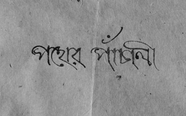
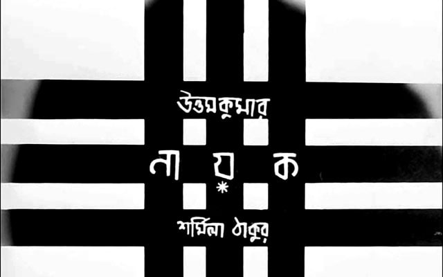
“For Ray, devising titles for his films was a totally creative pursuit. His first film itself displays that. Pather Panchali’s (Song of the Little Road) titles are written in calligraphic font on handmade paper in the style on a scroll, synonymous with the folk tale. Nayak’s (The Hero) title again stands out for its novelty. In the opening sequence, Arindam Chatterjee (Uttam Kumar) is seen behind bars which slowly vanish as the titles progress. Till the star is revealed in entirety. Sandip agrees that this title is open to interpretation. The star could either be a prisoner of his world or may be behind ‘gates’ of a celluloid strip. The film, in fact, brings out the real life of the star behind his gloss and glamour.
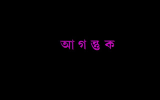
Agantuk’s (The Stranger) main title, the master’s farewell film, again dissolves in a mist, on which the other titles emerge, underscoring that Agantuk, the protagonist (played so brilliantly by Utpal Dutt), is an enigma.
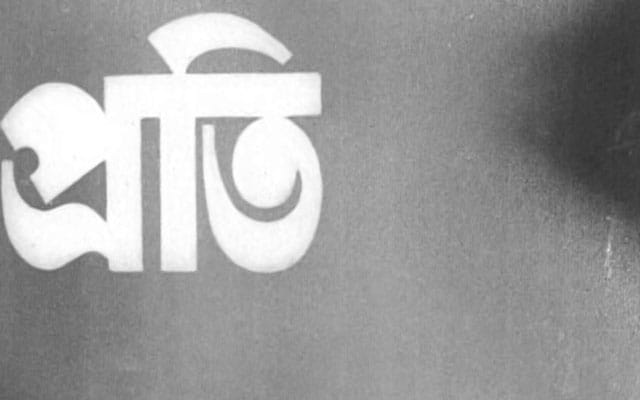
Pratidwandi (The Adversary) brings out that conflict through the title. And, Siddhartha’s (Dhritiman Chatterjee) father’s death is shown in negative print underscoring a loss in the protagonist’s life. In some interviews, Ray had, of course, aired a simple explanation to his going for a negative style, saying that it was to disguise flaws which may appear while showing a death scene with a person who was actually alive. But, use of the negative recurs in the film when the nurse played by Shefali, lights a cigarette for Siddhartha. Thus, throwing open these scenes to subtle interpretation. Anything which Siddhartha deeply mourns (his father’s death) or dislikes in shown in negative.
“Father’s titles are up for interpretation. In fact, just in case, a documentary film is made on father’s film titles, one will witness the progression. During Aparajito (The Unvanquished) , father had bought several decorative wooden blocks which were available in the ghats of Benares. He used these in the calligraphic titles of Teen Kanya. He would engage in these pursuits,” Sandip reveals.
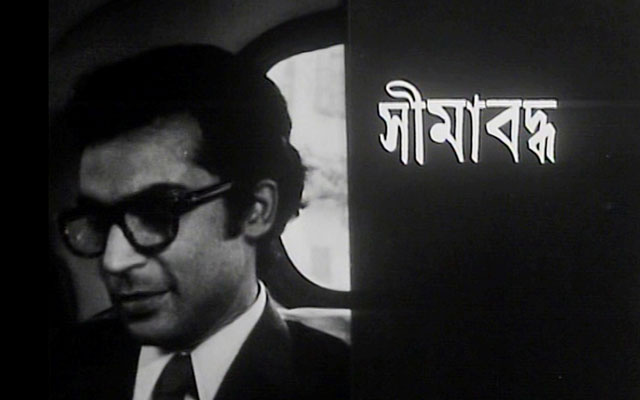
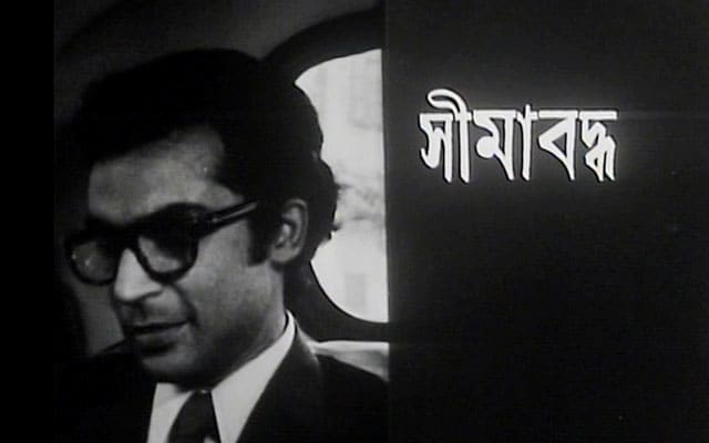
Seemabaddha (Company Limited) had seen a split-screen approach in the title – tele printers reeling out sheets or telephone calls where the title music is reduced. Again, opening up an interpretation that protagonist Shyamalendu (Barun Chanda) is confined in his corporate world.
“Paras Pathar’s (The Philosopher’s Stone) original title negative is either lost or damaged. It reflected letters designed in the shape of diamonds. What we see now is the title of the French version of the film. Devi’s title (The Goddess) is also extremely interesting. It shows the transformation of the character and role from the outset till the finish.
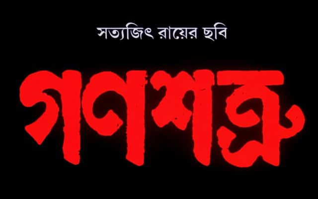
The titles of Ganashatru (Enemy of the People) titles were again done with woodblocks. “Woodblocks were a vanishing art by then. We went to Chitpore (in north Calcutta) looking for woodblocks and luckily stumbled upon them in a shop. We picked up some of them of which father chose one for the titles. Shakha Proshakha (Branches of a Tree) witnesses the graphic of cardiological ECG machine running through the tiles,” Sandip says, describing the uniqueness of Ray’s film titles continuing till the end of his film making life. It happens that Satyajit Ray was suffering from a debilitating cardiac ailment in the end years of his life. Shakha Proshakha’s title probably manifests the master’s state of mind when he made the film.
With Goopy Gyne Bagha Byne (The Adventures of Goopy and Bagha), Kanchenjungha and Sonar Kella (The Golden Fortress), the master returned to straightforward painting and sketches of his Kala Bhavan days as far as the titles go. While Goopy-Bagha’s titles exhibit wash painting in all its array, Kanchenjugha’s is full-fledged painting with colours by Ray while Sonar Kella’s titles brought poster colour sketches of Rajasthan to the fore. “Goopy Bagha’s are in sequence. So, if they were to be juxtaposed with the screenplay, if ever, they could act as illustrations. Kanchenjungha’s paintings bring out anecdotal incidents in Darjeeling,” narrates Sandip.
Goopy Gyne Bagha Byne’s title music is also singularly masterly. A song or music melts into the other, ultimately capturing every song or signature music composed for the film. The title, laced with music, is nothing short of stupendous. Again, the last scene turns into colour as the camera zooms into a large butterfly motif on floors of the Shundi palace. The motif was throughout there on the palace floors, but coloured paper was pasted on it and shot was taken in colour. This could also symbolise the splash of colour entering the lives of Goopy and Bagha with the announcement of marriages to the princesses of Shundi and Halla.
“Initially, a plan had surfaced to shoot Goopy Bagha in colour. But, father decided to finally shoot the film in black and white for two prime reasons. First, shooting a film in colour would be an expensive proposition. And, secondly the technical aspects of a colour movie were of an inferior quality those days. Colour was then in its nascence. A dissolve or fade-out shot was of an extremely poor level technically. This reasons father going for straight cuts in those times. It’s not like today where everything can be achieved at the press of a button or key. The technical elements involved in making a film in colour only began improving during the time when Ashani Sanket (Distant Thunder) was made (in 1973). In fact, the colour gradation of Sonar Kella’s last shot was not up the mark. Father was not happy with the last shot of Sonar Kella and that of Kanchenjungha,” confesses Sandip. But, audiences went unaware of these factors because the narratives were so powerful.
“Father would start drafting his screenplays with a predetermined thought that he would do away with shots revolving around fade-ins, fade-outs, mixes and dissolves. The script changed to an extent based on the type of shots put to use,” underscores Sandip.
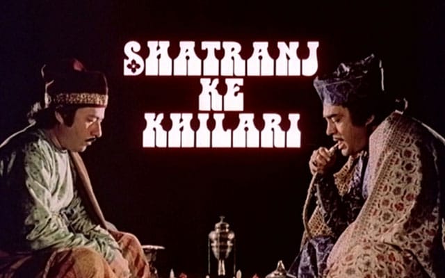
Shatranj Ke Khilari’s (The Chess Players) beginning, at the same time, is tremendously stylised with two hands appearing from the corner of the frame as a chess game progresses. But, the game immediately crystallising on the screen is symbolic of political machinations which later unfold in the film.
“A great deal of time and thought used to go into the crafting of titles. Given the state of technology available during father’s time, he was always circumspect whether the title would finally match the desired levels. With the experimentation in devising the titles for Aranyer Din Ratri, he was left wondering till the end whether the title would materialise as expected.
“Father passed away in 1992. Film technology was still far from making the advances it has made today,” says Sandip, making a point. Given his superlative creative artistry, the master was always clueless whether the state of technology in his days would deliver and complement his artistic needs.
“You had to wrack your brains at that time about ways to create a title. There were no computers or buttons and keys. Nayak’s title was ‘taken’ with black strips pasted on white paper. Each strip was peeled off one at a time. Finally, the entire image of the star becomes apparent. The lab in charge of India Film Laboratories in those times, R.B. Mehta, who was a very respected technician, helped father create this title. It was very painstaking. One had to think through the process. There was no instant solution. That’s what we call Necessity is the Mother of Invention,” emphasises Sandip.
The thought for making titles took root from the editing stage. That’s when Satyajit Ray found out from technicians working in the laboratories whether a particular title typeface or style, he was contemplating, would at all be possible. If it was achievable, then he would tune his title music compositions to that form of title.
“Other film directors in world cinema would normally approach a visualiser to work out titles. Maurice Binder had created many of the James Bond titles. While Saul Bass had fashioned titles for Alfred Hitchcock and Billy Wilder. He was also a graphic designer and had also created posters. Bass is legendary for this department of movie work. Titles, as a creative input in a film, were visualised from the sixties when they showed up in the Hitchcock and Bond films,” points out Sandip.
But, he is not aware of any other director in World Cinema who has also devoted his energies for title making like his legendary father had. It was extremely intricate brainwork. Of course, it was intellect and emotions working in tandem.
Ashoke Nag is a veteran writer on art and culture with a special interest in legendary filmmaker Satyajit Ray.
All images from Satyajit Ray Society.
Read all the Latest News, Trending News, Cricket News, Bollywood News, India News and Entertainment News here. Follow us on Facebook, Twitter and Instagram.

