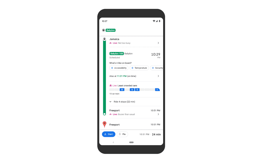
Google Maps will show you which cars are the lease crowded on some train lines.
Google on Wednesday announced several new features for Google Maps.
It’s expanding a feature that shows you how crowded a transit line is to 10,000 cities across 100 countries. But it’s also testing something even more granular: the option to see which cars on a specific train are the most crowded on New York’s Long Island Railroad and for transit lines in Sydney, Australia.
Both features may help you avoid more people if you’re worried about being jammed in with lots of other commuters as you return to work during the pandemic.
The information will appear when you search your route. If, for example, you’re searching for trains from New York Penn Station to Long Island on the Long Island Railroad, you’ll see data on how crowded a train is and which cars have the most seats available. If it’s on a railroad that doesn’t yet offer the more granular data, you’ll still see if the train is crowded or not. The feature is rolling out now to Google Maps users, so you may not see it quite yet.
In case your workplace is flexible on commute times, Google said that, nationally, you’re more likely to get a seat if you travel at 9 a.m. versus between 7 a.m. and 8 a.m. And the same is true if you commute at 3 p.m. instead of between 4 p.m. and 5 p.m.
Google said the data is provided by Long Island Rail Road in New York and Transport for New South Wales in Sydney. More cities will support the open seat feature in the future, Google said.

